Let's Create Together
Available for freelance projects, consulting opportunities, and full-time positions. Let's create accessible, data-driven digital experiences that make a real impact.
+44 7444148652 | +91 7303010238
© 2026 Vedant Khandelwal • UX Designer
Context
ABOUT
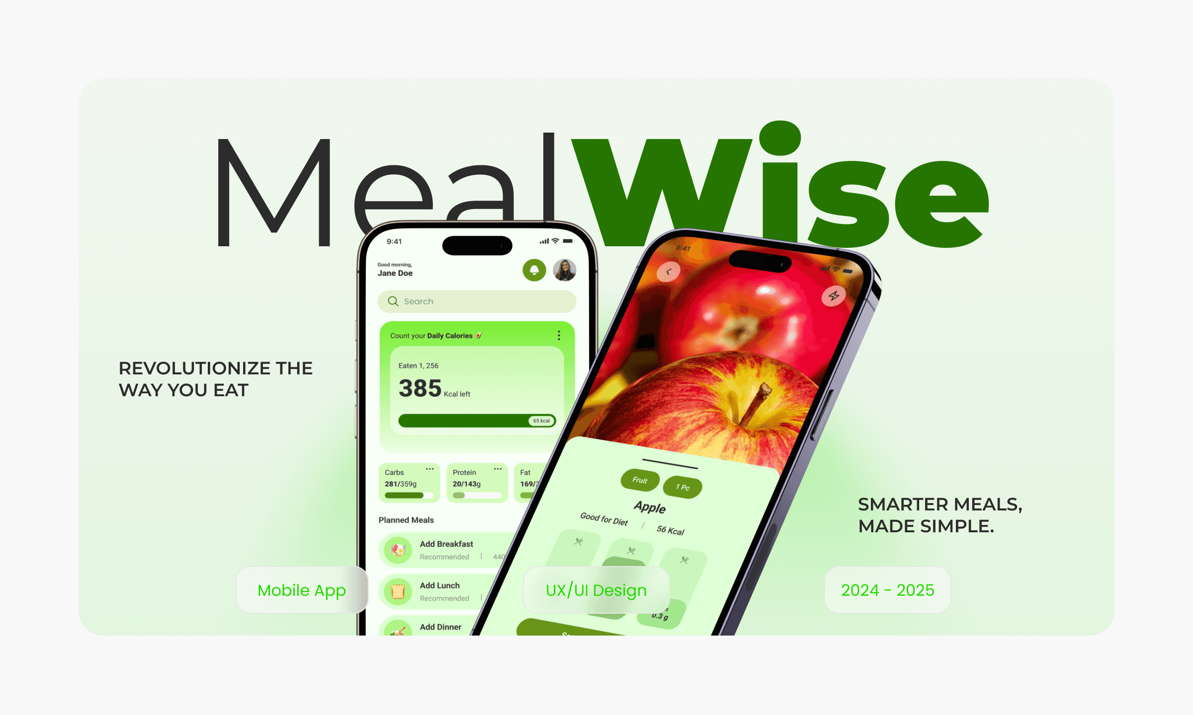
MealWise is an AR-based mobile application designed to empower individuals to make informed and healthier food choices. By utilizing advanced augmented reality technology, MealWise provides real-time nutritional analysis, personalized recommendations, and valuable insights to help users achieve their dietary and fitness goals.
With MealWise, you can simply scan food items using your device's camera to instantly access detailed nutritional information, including calories, macronutrients, and micronutrients. The intuitive interface and engaging visuals make it easy to understand and interpret the data, empowering you to make informed decisions about what you eat.
PROBLEM
Consumers face overwhelming choices, limited time, and lack of expertise when making food decisions. This creates a need for innovative solutions to empower healthier choices.
TASK
The task was to design a nutrition-first meal planning experience that simplifies healthy eating by guiding users from meal decisions to portion control and grocery planning, while keeping the experience intuitive, practical, and easy to sustain in everyday life.
SOLUTION
MealWise addresses the challenges of informed food choices by leveraging augmented reality technology. This innovative app provides real-time nutritional analysis, personalized recommendations, and educational resources to empower users to make healthier decisions.
KEY FEATURES
MealWise offers personalised meal plans combined with portion-based recipes and smart grocery lists, helping users know exactly what to cook, how much to eat, and what to buy. By focusing on home-cooked meals and simple nutrition guidance, the platform reduces decision fatigue and supports consistent healthy eating.
My Role
I worked as the UX/UI Designer, responsible for research, defining user flows, structuring information architecture, and designing wireframes and high-fidelity interfaces for a mobile-first experience.
Strategy
🔭
Product Direction
🧭
Discovery
🔎
Interviews
🗣️
Surveys
📝
Personas
👤
Journey Map
🗺️
Ideation
🧠
Information Architecture
🧾
User Flows
🔀
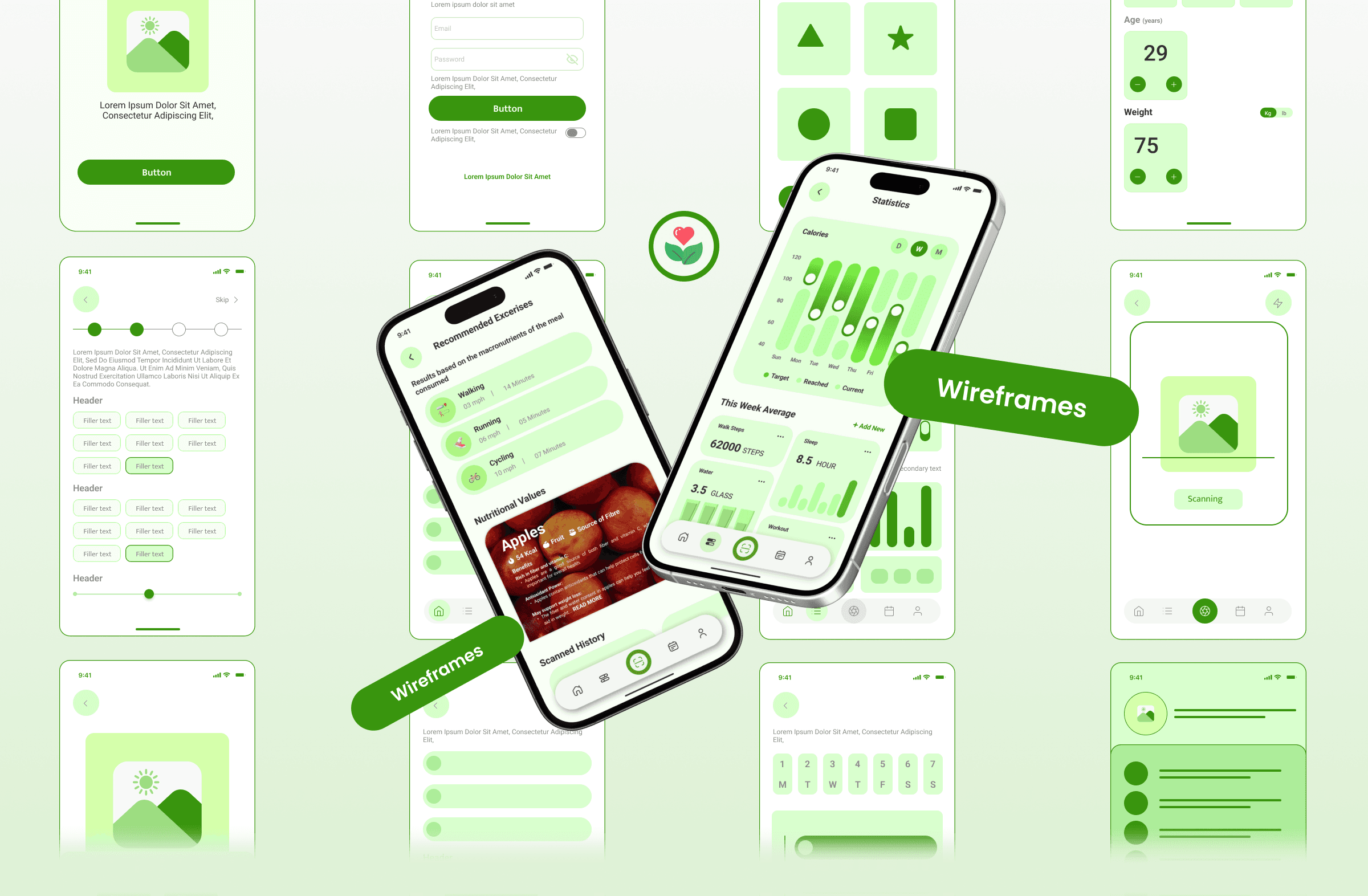
Wirframes
🧱
Interaction
🧩
Iteration
🔁
UI Design
🎨
Design System
📊
Usability Testing
🧪
Prototyping
🎛️
Insights
📊
Impact
MealWise helped reduce decision fatigue around daily meals by giving users clear direction on what to cook, how much to eat, and what to buy, leading to more consistent home-cooked eating habits.
Timeline
The project was completed over a 14-week design sprint, covering research, ideation, wireframing, and high-fidelity UI design.
Project timeline
Week 1 - 3
Week 8 - 10
Week 11 - 12
Week 12 - 14
Week 4 - 5
Week 6 - 7
Research
Information Architecture
Wireframes
UI Design
Prototyping
User Testing
Development Process
The development process focused on understanding user behaviour and translating nutrition needs into a simple, guided, and actionable product experience.
📝
Surveys & Open-Ended Interviews
Collected qualitative insights to understand users’ eating habits, pain points around meal planning, portions, and grocery shopping.
🧑🤝🧑
User Persona Development
Created personas based on lifestyle, health goals, and cooking behaviour to keep design decisions user-focused.
🗺️
User Journey Mapping
Mapped the end-to-end journey from meal planning to grocery shopping to identify friction points and opportunities.
📱
Wireframes & Prototypes
Designed low-fidelity wireframes and interactive prototypes to validate flows and usability early.
✅
Testing & Refinement
Iterated on designs using feedback to improve clarity, reduce cognitive load, and streamline the overall experience.
User Surveys and Interviews
User surveys and open-ended interviews were conducted to understand how people currently plan meals, manage portion sizes, and shop for groceries. The research revealed that users feel overwhelmed by nutrition decisions, struggle with consistency, and want clear guidance rather than too many choices when it comes to healthy eating.
Main Goals
User interviews and surveys for MealWise aimed to identify relocation challenges, user needs for local info, and social connection barriers.
Find common relocation pain points
Identify valuable resources for users
Understand preferred ways to connect locally
🧑🏻🦱
Saul Goodman
42, Male
Occupation:
Working Professional
Leads a busy, desk-bound lifestyle with limited time for meal planning and physical activity.
Lifestyle:
Improve overall health
Maintain a healthy weight
Prevent chronic diseases
Goals & Needs:
Limited time for meal planning and preparation
Difficulty understanding complex nutritional information
Lack of motivation to stick to healthy habits
Challenges:
Desire to feel better physically and mentally, improve self-esteem and live a longer, healthier life.
Motivation:
🧑🏻🦱
Kim Wxler
22, Male
Occupation:
PG Student
Follows a semi-sedentary student lifestyle with irregular routines influenced by academic schedules.
Lifestyle:
Maintain a healthy diet while studying
Balance academic demands with personal well-being and save money on food expenses
Goals & Needs:
Limited cooking skills, irregular meal times due to study commitments
Access to affordable, healthy food options
Challenges:
Improve concentration and focus, boost energy levels and prevent nutrient deficiencies
Motivation:
User Survey Analysis
We surveyed over 500 users to understand their needs, preferences, and pain points with existing food delivery apps.
Key Findings
Positive Impact on Eating Habits
•
33.3%
increased awareness of nutrition
•
25%
made healthier choices
•
25%
tracked calories
•
16.7%
improved well-being
Feature Satisfaction
•
83.3%
found nutritional information clear
•
66.7%
found recommendations helpful
Demographics
Gender Distribution
58.3% Male
41.7% Female
User Base
Diverse user base, primarily young adults
Overall Satisfaction
75%
Extremely satisfied
Extremely satisfied
75%
Satisfied
16.7%
Neutral
8.3%
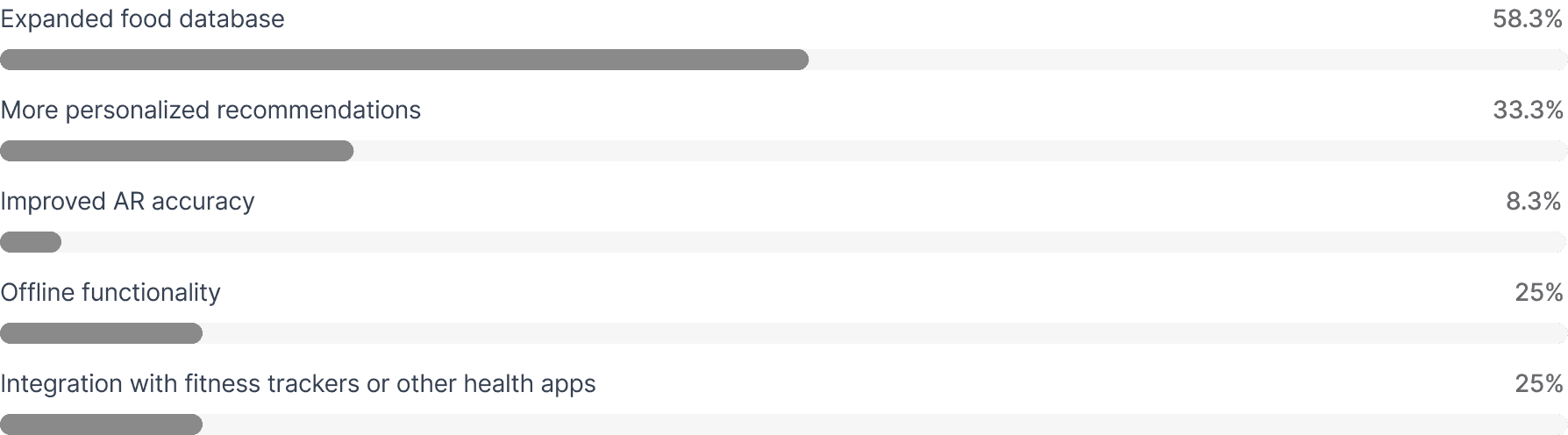
Feature Improvement Requests
What features or improvements would you suggest for future versions of the app?
Challenges Identified
Limited food database:
Users reported difficulty finding some specialty or international foods
Lack of customization options:
Some users wanted more control over dietary preferences and restrictions
Summary
Overall, the app is well-received, with positive impacts on eating habits and user satisfaction. However, expanding the food database and addressing customization needs can further enhance the user experience.
Research & Discovery
User Interviews
Conducted in-depth interviews with 20 frequent food delivery app users to understand their behaviours, frustrations, and needs.
Key Insight: Users wanted faster reordering and better filtering options
Competitive Analysis
Analyzed 6 major food delivery platforms to identify best practices and opportunities for differentiation.
Key Insight: Competitors lacked personalization and smart recommendations
Analytics Review
Examined user behavior data to identify drop-off points and understand where users were getting stuck.
Key Insight: 60% of users abandoned checkout during payment entry
User Surveys
Surveyed 500+ users to validate findings and gather quantitative data on feature preferences.
Key Insight: 85% wanted real-time order tracking improvements
Research Findings
Our research revealed that users prioritized speed and simplicity above all else. They wanted to find food quickly, customize easily, and track their orders in real-time. The current design failed to meet these basic needs, creating friction at every step of the journey.
The Solution
Feature 1
Smart Home Screen
Redesigned the home screen with personalized recommendations, quick reorder options, and curated collections. Users can now find their favorite restaurants and discover new ones without endless scrolling.
Quick Reorder
One-tap reordering from previous orders with smart suggestions
Personalised Feed
AI-powered recommendations based on preferences and habits
Feature 2
Advanced Filtering System
Created a powerful yet simple filtering system that lets users find food by cuisine, dietary restrictions, price range, delivery time, and ratings. Filters remember user preferences for future sessions.
Dietary Preferences
Filter by vegan, vegetarian, gluten-free, and more
Smart Sorting
Sort by delivery time, rating, or distance
Feature 3
Simplified Checkout
Reduced checkout from 5 steps to 2. Users can now review their order and confirm payment in seconds. Added saved payment methods and delivery addresses for even faster ordering.
Express Checkout
Complete order in 2 taps with saved information
Smart Defaults
Auto-select preferred address and payment method
Feature 4
Real-Time Order Tracking
Built a comprehensive tracking system that shows order status in real-time, from preparation to delivery. Users receive push notifications at each stage and can communicate directly with their driver.
Live Map Tracking
Watch your delivery driver's location in real-time
ETA Updates
Accurate delivery time estimates with live updates
User Interaction Flow
This user journey map outlines the key steps involved in using the Foodie app. It provides a visual representation of the user's interaction with the app from launch to post-order experience.
1
App Launch & Onboarding
Users are templates see an AR tutorial screen
Create an account or login to access features
Input basic user information (age, location, dietary)
2
Onboarding and Analysis
App recognizes food item using AR technology
Displays nutritional information (calories, protein, vitamins)
3
Personalized Feed
Curated personalized recipe recommendations based on dietary preferences
Adjust recommendations to match user goals
4
Additional Features
Access to educational content, meal plans, and community features
5
Post Experience
Rate app or contribute using push notifications
Share feedback or review app
Typography
I chose Roboto for MealWise because its clean, modern design enhances readability and gives the app a fresh, professional look. Its versatile weights and multilingual support make it ideal for clear, consistent UI across all screens, perfectly reflecting Hobnob’s user-friendly and contemporary brand.

Aa
Aa Bb Cc Dd Ee Ff Gg Hh Ii Jj Kk Ll Mm Nn Oo Pp Qq Rr Ss Tt Uu Vv ww Xx Yy Zz
1 2 3 4 5 6 7 8 9 0 ‘?’ “!” (%) [#] {@} / & \ < - + ÷ × = > © ₹ $ € £ : ; , . *

Regular

Semibold

Bold
Colour Palette
The fresh and balanced color palette used in MealWise—featuring shades like BEFDA0, 77E145, and #EDEDED—creates a clean and calming experience that reinforces healthy eating habits. The greens evoke freshness, nutrition, and growth, while the neutral tones keep the interface light and easy to navigate, helping users feel motivated, focused, and comfortable while planning and preparing home-cooked meals.
Soft Mint Green
Fresh Leaf Green
Neutral Grey
Hex: BEFDA0
RGB: 190 253 160
Primary
Hex: 77E145
RGB: 119 225 69
Additional
Hex: EDEDED
RGB: 116 75 54
Accent
UI Design
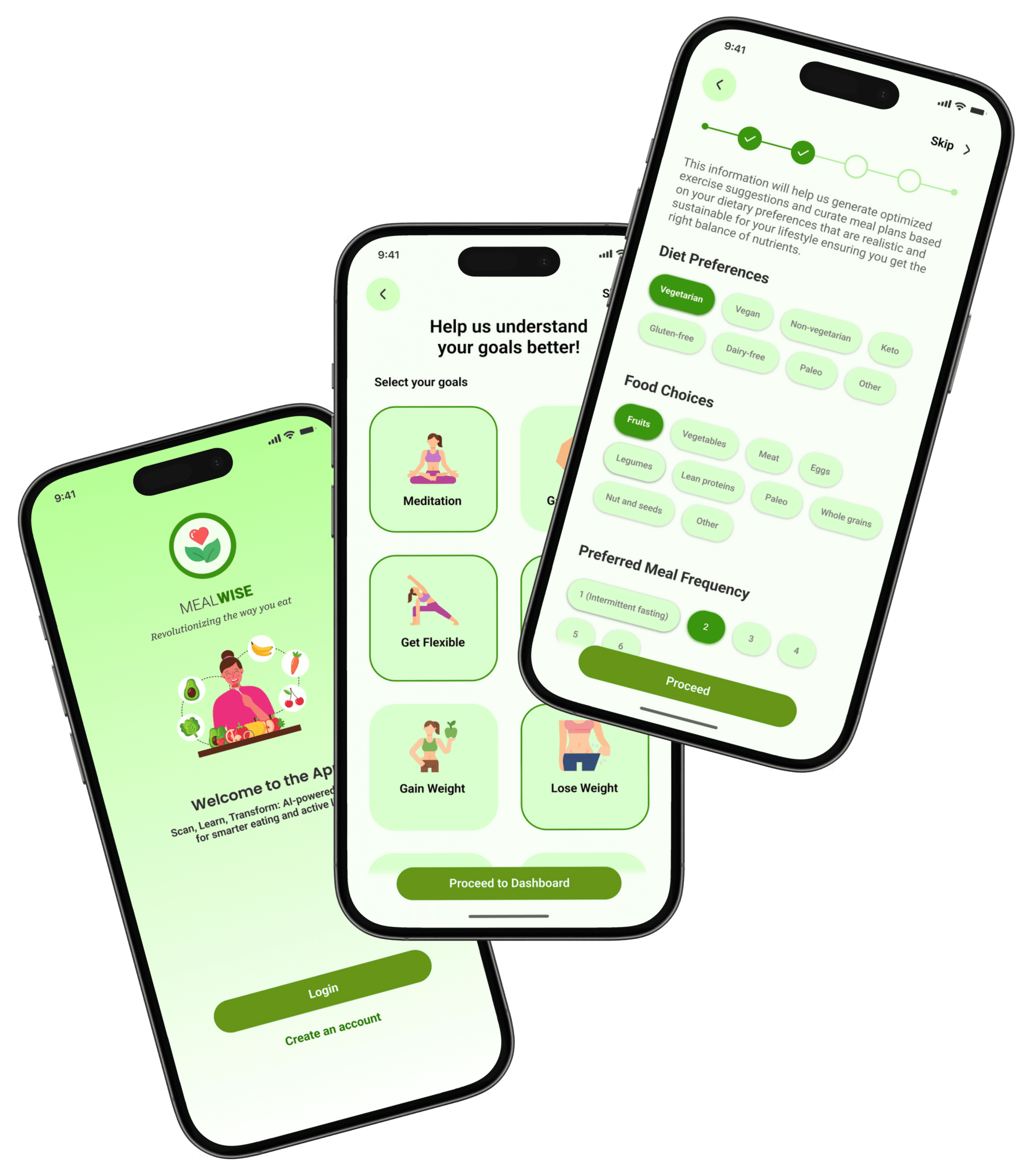
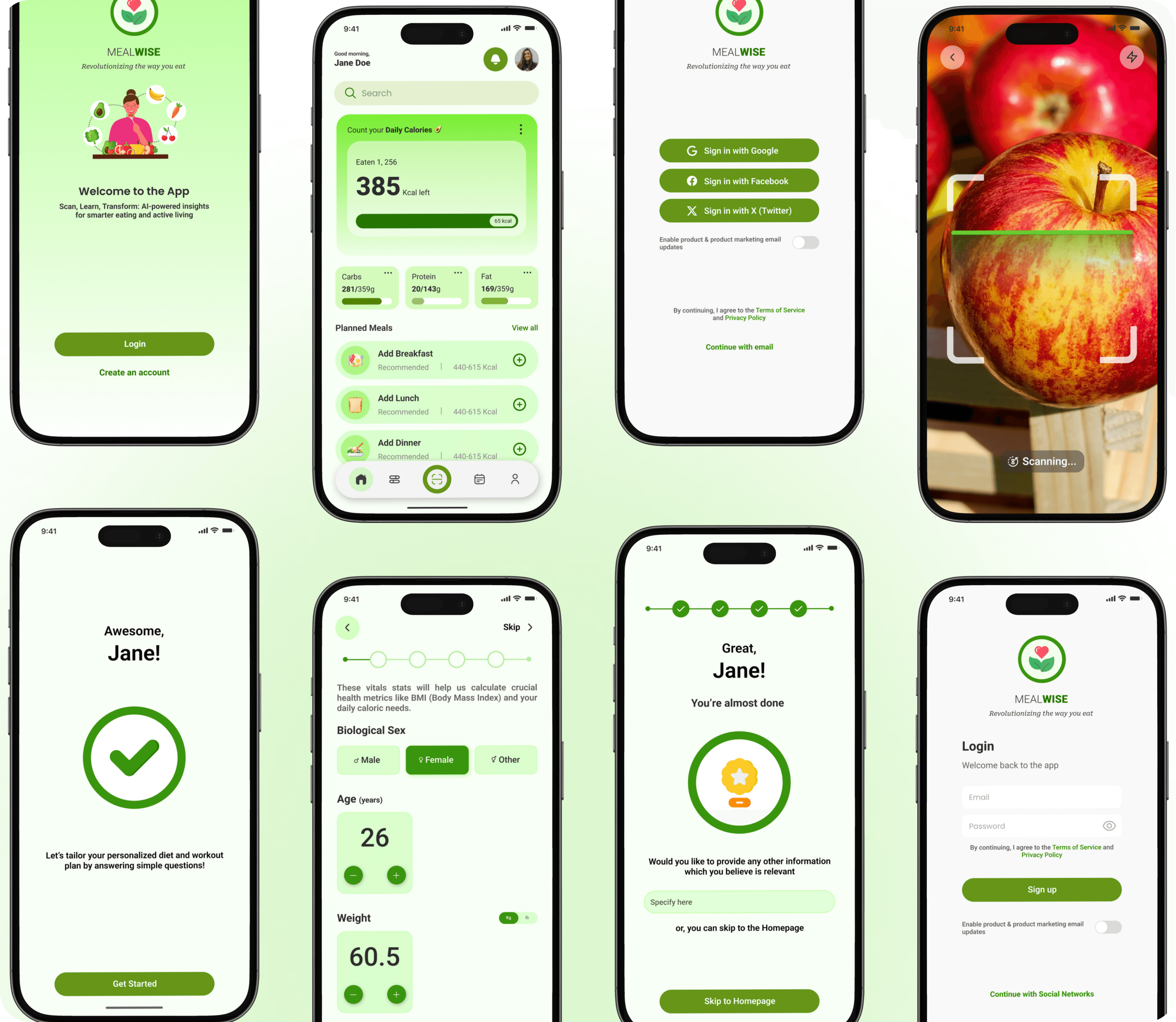
ONBOARDING
MealWise’s onboarding is quick and intuitive, starting with an easy login and a clear introduction to the app’s purpose. Users then select their health goals and share basic lifestyle, fitness, and diet preferences through simple, guided steps. Each screen explains how the data helps personalize recommendations, ensuring a smooth setup and a tailored nutrition and wellness experience from the start.
01
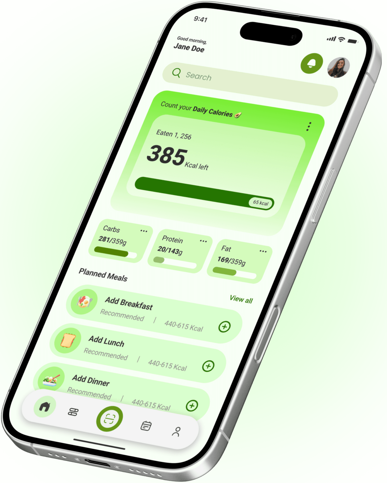
Homepage
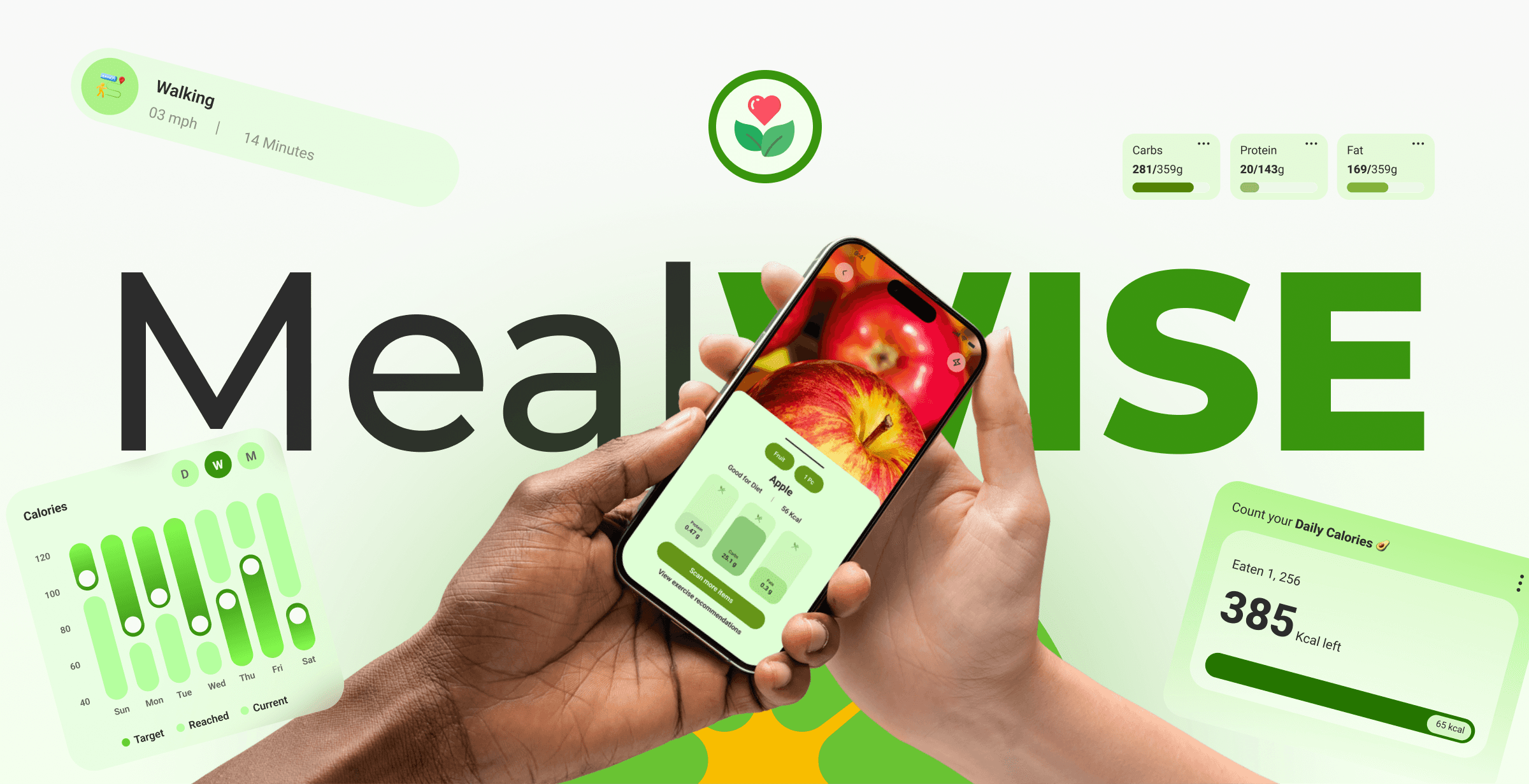
The homepage gives users a clear snapshot of their daily nutrition at a glance. It highlights remaining calories with a visual progress bar, along with a macro breakdown for carbs, protein, and fats. Planned meals are shown contextually with smart calorie recommendations, making it easy to add meals quickly. The layout prioritizes clarity, quick actions, and motivation, helping users track, plan, and stay consistent throughout the day.
02
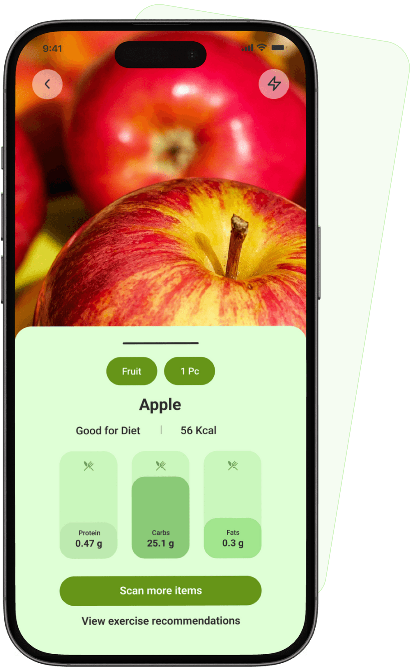
Scan Food Feature
This screen shows the AI-powered food scanning experience. Users can instantly scan an item to identify the food, portion size, and calorie count. The app highlights whether the item fits the user’s diet goals and provides a clear macro breakdown for protein, carbs, and fats. Quick actions like scanning more items or viewing exercise recommendations make tracking effortless and encourage informed, real-time food choices.
03
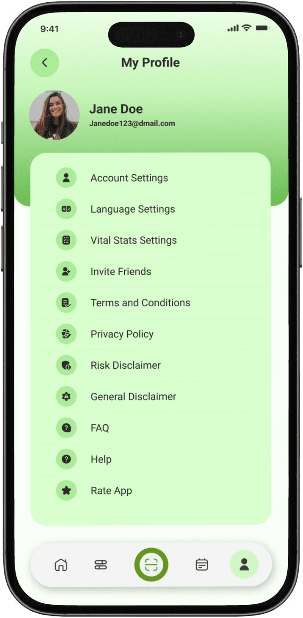
PROFILE
The Profile screen acts as the user’s control center. It displays basic account information and provides quick access to settings such as account preferences, language, and vital stats. Additional options like inviting friends, viewing policies, FAQs, and help ensure transparency, support, and easy account management within a single, organized space.
04
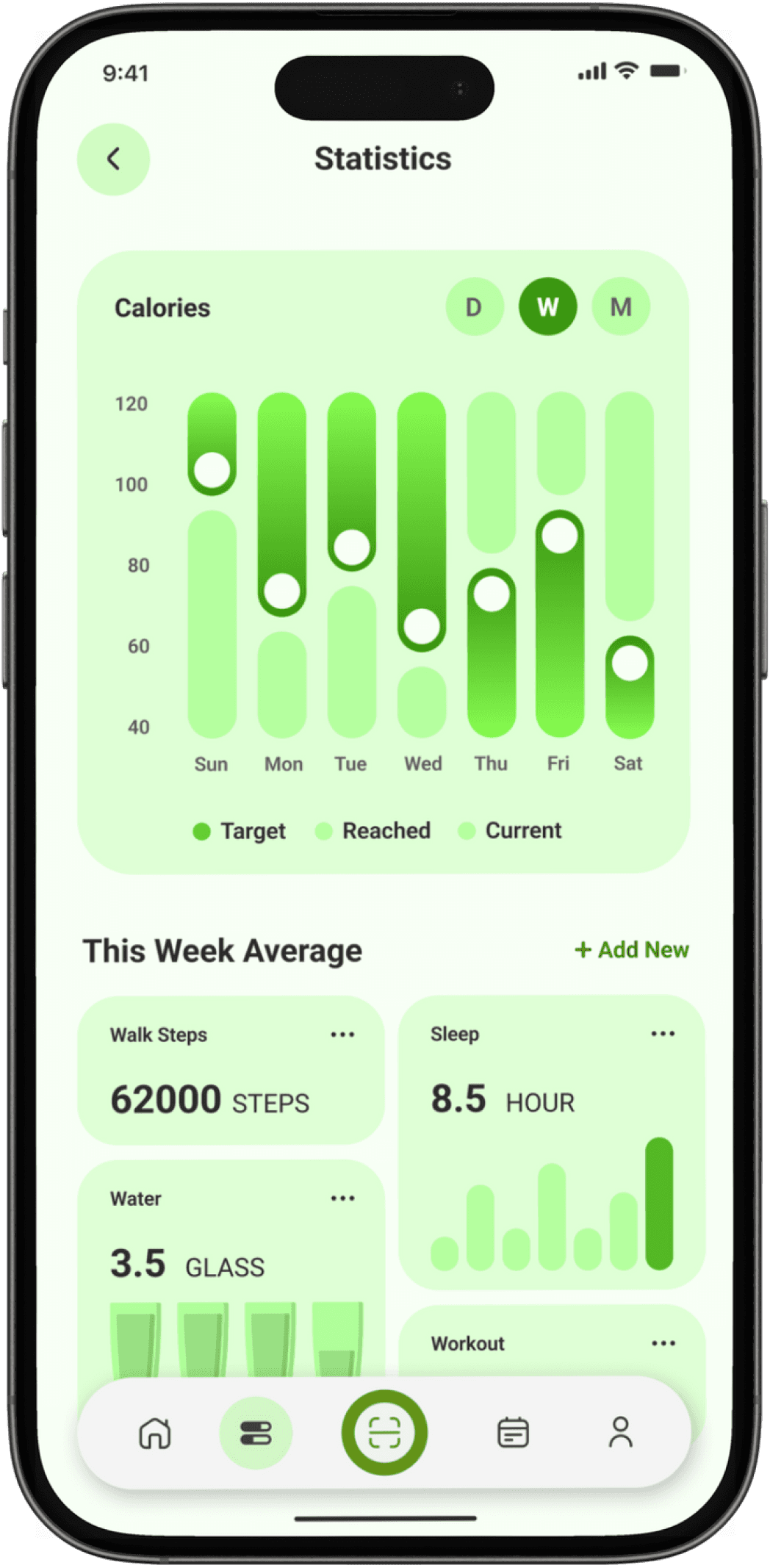
STATISTICS
The Statistics screen helps users track progress over time through clear, visual insights. It shows calorie trends across daily, weekly, and monthly views, along with comparisons between targets and actual intake. Supporting metrics like steps, sleep, water intake, and workouts give a holistic view of health habits, motivating users to stay consistent and data-aware.
05
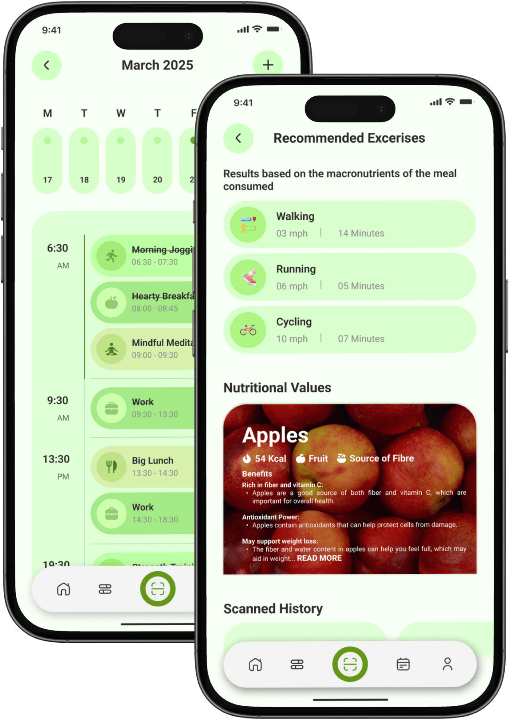
Calendar & Goal-Based Recommendations
These screens work together to help users plan and act on their wellness goals. The Calendar screen provides a structured daily timeline where users can view and manage meals, workouts, meditation, and work routines, making healthy habits easy to plan and track. Complementing this, the Recommendations screen suggests exercises based on the nutritional value of consumed meals and user goals, while also offering food insights and scan history. Together, they bridge planning and action, helping users make smarter, goal-aligned lifestyle choices every day.
06
Post-Research Enhancements
To ensure Foodie delivers a seamless and supportive experience for users, we followed a structured process of testing and refinement. By involving real users throughout development, we identified pain points, gathered actionable feedback, and continuously improved the app's usability and effectiveness.
Usability Tests
The prototype was tested with users who matched our target audience. These sessions revealed navigation challenges, interface clarity issues, and other user experience problems that informed our design decisions.
Feedback Collection
User feedback was carefully analysed to enhance the design, address specific pain points, and improve overall usability ensuring Foodie truly meets the needs of its users.
Iterative Approach
I repeated the testing and improvement process multiple times, refining the app with each cycle. This iterative method allowed us to achieve an optimal, user-centered solution that supports users at every step.
Conclusions
Foodie is more than just an app—it's a lifeline for those navigating the complexities of modern food delivery. By addressing practical needs like speed, convenience, and personalization while fostering meaningful connections through features like favorites and recommendations, Foodie ensures that busy professionals, students, and families feel supported every step of the way.
With its structured approach, personalized recommendations, and innovative features like quick reorder and real-time tracking algorithms, Foodie stands out as an essential tool for anyone seeking a better food delivery experience on this challenging yet exciting journey!
Key Findings
01
User-Centred Design Is Essential:
Direct involvement of real users throughout the design and testing process revealed unique pain points and needs, ensuring the final product is truly tailored to those it serves.
02
Simplicity Drives Engagement:
Streamlining navigation and focusing on clear, intuitive interfaces made the app more approachable, reducing friction and encouraging frequent use.
03
Smart Features Build Lasting Value:
Integrating intelligent tools like quick reorder and personalized recommendations proved crucial for helping users save time and feel supported, especially in their busy daily routines.
04
Personalization Enhances the Experience:
Offering tailored recommendations and relevant local deals significantly increased user satisfaction, showing the power of personalization in fostering trust and loyalty.
What's Next?
1
Group Ordering
Developing a feature that allows multiple users to add items to a shared cart, making it easier for groups to order together.
2
Subscription Plans
Exploring a subscription model for frequent users with benefits like free delivery and exclusive restaurant access.
3
AI Menu Scanning
Implementing OCR technology to let users scan physical menus and instantly view digital versions with ordering capability.
4
Social Features
Adding ability to share favorite dishes, write reviews, and follow friends to discover new restaurants through your network.
UX CASE STUDY 2025
By Vedant Khandelwal
vedant.khandelwal213@gmail.com


Let's Create Together
Available for freelance projects, consulting opportunities, and full-time positions. Let's create accessible, data-driven digital experiences that make a real impact.
+44 7444148652 | +91 7303010238
© 2026 Vedant Khandelwal • UX Designer
